Thoughts on Line: Edmund Sullivan's Line: An Art Study
 |
I didn't read Edmund J. Sullivan’s Line: An Art Study all at once, but piece by piece over a few months. Besides just life getting in the way, I took this book slowly because it isn’t the kind of book you get lost in. It’s written in an older style and it references people and ideas that are not around anymore. That makes a lot of the book nonsensical. So you have to wade through that to find the parts that are still helpful. Sullivan also has the attitudes of a man of his time, including the casually racist ones (he has no trouble tossing around the word “nigger,” for example). For all that, Sullivan was an incredible pen-and-ink artist and his thoughtful observations about the craft come from years of experience. So because of these two things- Sullivan’s insights and Sullivan’s attitudes- I feel the need to recontextualize what he says. Also, his insights are rooted in a pen-and-ink style that is not popular anymore and he of course wasn’t considering comics. So again, I feel the need to put his ideas into my own context. So here we go… |
Line weight
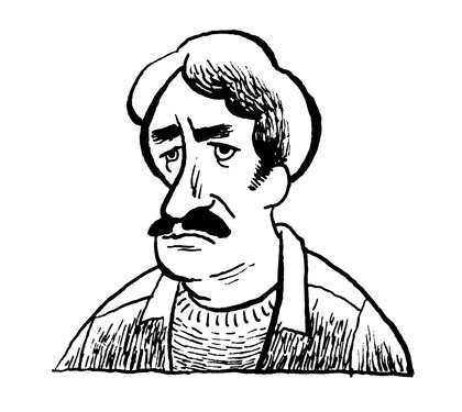
One thing using a dip pen gives you is the ability to modulate line weight. Often, the rationale for this is that heavy lines are used to depict areas of shade. Sullivan makes an interesting observation about this; he calls it “doubly wrong” (74). He thinks that the heavier lines should be on the side of the object nearest the light source. This is for two reasons. One, if the heavier line is on the shaded side, then that side tends to come forward rather than recede. As in painting, darker shapes seem near, while lighter shapes seem distant. He shows a drawing of a head with the far side in shade outlined with a heavy line and it makes the head seem odd, because the dark side, which is supposed to be receding, actually comes forward. His second reason is for contrast. The light side will seem lighter if set off with a darker line. I can also think of a third reason: the thick line will get lost in the shading and so lose its power.
So here, the egg on the left has the weighted line on the shaded side and the egg on the right has the weighted line on the light side. Notice how for the egg on the left, all your attention sinks to the bottom right. The egg on the right has a fuller form. The line weight and the shading balance each other. And as a result, the center comes forward and the whole thing seems more three-dimensional.
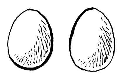
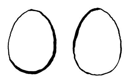
Still, if one doesn’t use any shading, which is much more common in drawings these days, then putting the heavier line towards the light source looks odd. The egg on the right looks a bit like it’s floating, while the one on the left seems more grounded.
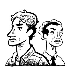
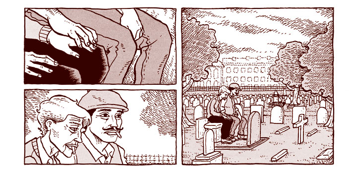
The other useful thing line weight is used for is the relative distance of objects in your drawing. As I said, darker objects come forward while lighter objects move backward. In the drawing below, the guy on the right seems farther away. This is partly due to him being overlapped by the guy on the left, but it’s also due to his lighter line weight. The guy on the left has a heavier line weight, so comes forward. There is also more line and tone variety in how he’s drawn. That also makes him command our attention more.
However, Sullivan doesn’t talk much about balancing line weight against itself. For him, it is always balanced based on some external rationale, like light source or relative distance. While he does say that varying line weights makes for a more visually interesting picture, he doesn’t abstract line from what it is supposed to represent. This is probably a result of his time period and tradition, but it limits his insights into line weight. Again, he only thinks of in representationally. Recently, I have been playing around with alternating line weight by putting a heavy line next to a thin one. So I change line weight not based on any claim on realism, but simply based on the lines themselves. I’m not saying that this is the best way to do things, but I present it as an option that Sullivan doesn’t consider.
Speaking of which, I of course think about this in relation to comics. Personally, I find really thick panel lines to be distracting. If the lines in the border are bolder than the lines in the drawing contained within, then the panel comes forward and takes attention away from the drawing you are supposed to be reading. Likewise, a panel composed on lines all of equal weight can be difficult to read. In my early comics, I didn’t vary line weight but used a lot of shading. That resulted in a lot of muddy panels.
Line harmony
I found this part of Sullivan’s book to be very interesting. Yet again, I wish he had gone even further with this topic. Basically, he says that you should have a rationale for how to do your shading. He offers three possibilities: the shading running across or perpendicular to the light rays (A), the shading running parallel to the light rays (B), and the shading being molded to the form of the subject (C).
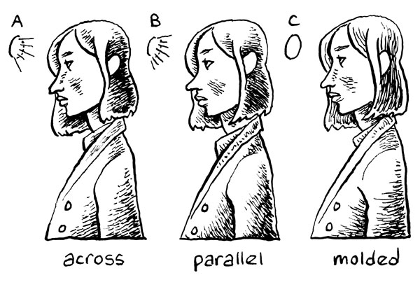
While Sullivan seems to prefer the third, his point is not that one approach is better than the others, but that if you mix approaches then the drawing will become muddied. I tend to use A or C, but honestly, before reading this book I didn’t consciously categorize these different methods. And when I first started with pen-and-ink, I didn’t consider my approach at all; I was just scribbling down lines. So Sullivan entreats us to stop a second and consider what we’re doing.
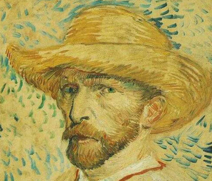
As before, Sullivan’s rationale is based on representing reality. Here, line harmony has to do with how one shades in relation to the light source. But of course, you could approach line harmony in other ways. You could gather your lines to a certain focal point or to convey a certain emotion. For instance, I once noticed that in a lot of his portraits, Van Gogh radiates his brush strokes away from the eyes. The result is that the eyes of his subjects have a particular intensity.
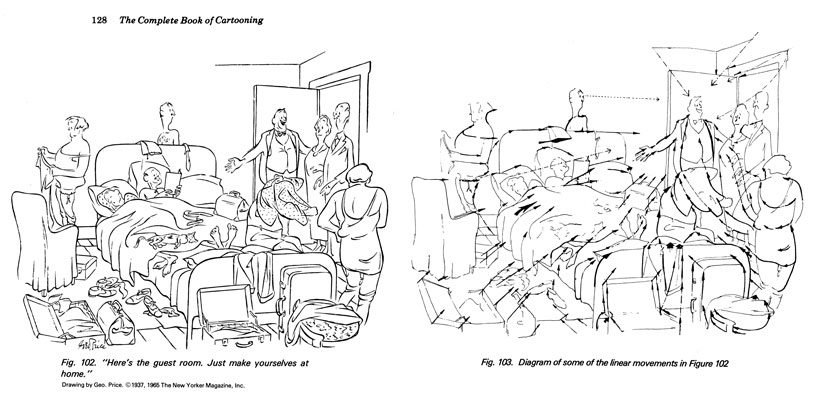
You could also arrange your lines to make your image more readable. This is something many cartoonists consider. In the example below, John Adkins Richardson shows how the lines in this George Price cartoon help draw the reader’s attention to the speaker (The Complete Book of Cartooning 128-9).
When you’re dealing with multiple panels, the lines from one panel can relate to the lines in another. Again, this can help readability. I did this in Carnivale on a few occasions. In these three panels from page seventy-two, I used the background shading lines to guide the reader’s eyes to the correct reading order. I was also hoping that the strong vertical lines of panel one would take the reader’s eyes down to panel two. And notice how the lines that compose the tree in the second panel swoop from the panel above to the panel on the right.
Sullivan says many more things in his book. He discusses perspective, anatomy, and beauty. But the ideas above are the ones specifically about line, not drawing in general. They are also the ones that stuck out to me the most and made me think. So while Line is an odd book in many ways, it still manages to teach after all these years.
(written October 26, 2016)
 This work by http://www.nijomu.com is licensed under a Creative Commons Attribution-NonCommercial 4.0 International License. |